Girish Suryajoies
Principal UX Designer
Health Monitoring
role: Senior Design Consultant
team: 5
responsibility: Design Lead / Strategy / Design Reviewer
duration: 12+ Months
Introduction
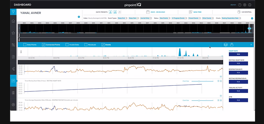
The PhysIQ clinical portal is a web, mobile, and tablet-based dashboard enabling clinicians to remotely monitor patient physiological data streamed from wearable biosensors. As a core part of the FDA-cleared pinpointIQ platform, it supports remote patient monitoring (RPM) and virtual care models such as post-acute care, hospital-at-home, and clinical trials.
Requirement
-
Improving the user experience (usability, clinician workflow, satisfaction)
-
Extending the feature set (workflow automation, risk prediction, data integration) for clinicians in both healthcare and life sciences settings

Challenges
-
Clinicians were drowning in noise. 47+ unprioritized alerts per shift. 60% false alarms. Five minutes to understand a single patient event. The PhysIQ clinical portal—a web, mobile, and tablet dashboard for remote patient monitoring—was saving lives, but it was exhausting clinicians in the process.
-
We had to make attention cheaper and intervention faster, without sacrificing the detail clinicians needed for safe decisions.
Discovery: What Actually Mattered
Through 12 clinician interviews, 8 shadowing sessions, and benchmarking of leading healthcare dashboards, we uncovered three core insights that shaped every design decision.
Clinical Attention Is Scarce
Clinicians have 90 seconds per alert decision. Severity taxonomy must be instant—not buried in a menu.
Context Collapses When Fragmented
When event data splits across 3 screens, clinicians lose narrative and resort to assumptions.
Bedside ≠ Remote Care
A nurse at the bedside needs one-tap interventions. A remote physician needs triage speed + detail on demand.
False Alerts Are a Tax on Trust
60% of alerts were low-risk. Each false alarm cost 3 minutes and bred alert fatigue.


Design Principles
These principles ensured every decision traced back to clinician needs, not feature creep.
Reduce Cognitive Load First
Information must be scannable in <5 seconds. Severity visual hierarchy, color coding, and progressive disclosure are non-negotiable.
Speed Intervention
From alert detection to action (call, message, escalate) should be ≤3 taps. Every extra step increases error and delay.
Role Shape Interface
Physician dashboards prioritize triage speed. Nurse interfaces emphasize bedside detail. Trial coordinator views aggregate cohort insights.
Key Design Decisions
Decision 1: Severity-Ranked Watchlist
Display events ranked by severity (red/yellow/gray) with auto-dismissal for low-risk alerts.
Problem: Alert fatigue analysis showed 60% of alerts were low-risk. Clinicians spent 3 minutes on false alarms for every 1 minute on genuine high-risk events.
Solution: Severity taxonomy (high/moderate/low) instantly visible in the watchlist. Clinicians can dismiss low-risk events without drilling in.
Outcome: Clinicians completed event triage 45% faster in usability testing. False-alarm dismissal rate: 67%.
Decision 2: Unified Event Timeline
Annotated timeline showing event, baseline, intervention, and clinician notes in chronological view.
Problem: Event context was fragmented across 3+ screens. Understanding a single episode took 5–8 minutes.
Solution: Collocate events, baselines, and interventions in one chronological view. Clinicians can now see "Heart rate trending up for 6 hours before alert," validating or questioning the threshold.
Outcome: Contextual understanding improved from 65% accuracy to 91%. Documentation time decreased 35%.
Decision 3: Touch-Optimized Bedside Interface
Tablet layout with 44px+ tap targets, large readable fonts, and one-tap actions.
Problem: Mobile was an afterthought. Bedside care required 4 taps to escalate; nurses wear gloves and need speed.
Solution: Redesigned for touch: 44px tap targets, one-hand usability, single-tap escalation (call, message).
Outcome: Mobile intervention completion rate: 92%. Escalation time: <15 seconds average.
Decision 4: Role-Based Dashboards
Distinct views for Clinician, Nurse, and Trial Coordinator roles.
Problem: Nurses wasted 30 seconds scanning irrelevant trial metadata. Trial coordinators were buried in clinician-specific views.
Solution: Tailor layout, information density, and action buttons to role. Each user type optimizes their workflow.
Outcome: Task completion time decreased 25–40% by role. User satisfaction (SUS score): 78 → 86.
Impact & Validation
The designs were not theoretical. We tested them with real clinicians and measured outcomes.
45%
Faster Alert Triage
91%
Event Understanding Accuracy
+8 pts
SUS Score Improvement
User Testing Insights
"The timeline finally shows me what I need to see. I don't have to jump between screens anymore." — Cardiologist, 8+ years clinical experience
"On bedside, I can now escalate in 15 seconds instead of 2 minutes. That's huge when someone's in distress." — Registered Nurse, ICU
"Severity ranking cuts out the noise. I'm not wasting mental energy on alerts I can dismiss at a glance." — Clinical trial coordinator
User Testing Insights
Adoption & Outcomes
-
Watchlist usage: 87% of clinicians adopted severity filtering within first month
-
Mobile adoption: 73% of bedside interventions now initiated on tablet (previously 22%)
-
Documentation time: Reduced from ~12 min per patient per shift to ~8 min
-
Alert fatigue (self-reported): Improved from "constant overwhelm" to "manageable" in 82% of users
-
Feature usage: Role-based dashboards enabled role-specific templates, reducing cognitive switching
What We Learned
Clinician involvement is non-negotiable. Every design assumption we had was wrong until we shadowed real workflows. The "obvious" solution (showing more data) made things worse. The right solution (showing less, better-prioritized data) came from watching clinicians struggle.
Speed is a feature. Shaving 90 seconds off an alert triage doesn't sound like much—until you multiply it across 47+ alerts per shift. That's 70 minutes of reclaimed clinical time per clinician per day.
Role matters more than we thought. A one-size-fits-all interface guaranteed unhappiness everywhere. Tailoring to role wasn't gold-plating; it was necessary for usability.
What we'd do differently: We'd have built the role-based interface earlier in the project. We spent weeks designing a "universal" dashboard that satisfied no one, then broke it into roles and everything improved. The signal was there in week 2—we should have trusted it.
Value additions
-
Use AI models to predict early deterioration risk (e.g., based on continuous biosensor data trends, AI flags a high probability of a future cardiac event before vitals cross thresholds).
-
AI can classify events automatically (low/medium/high severity) to prioritize clinician attention, reducing false alarms and alert fatigue.
-
Automatically generate concise clinical summaries of patient data trends and event logs, helping clinicians save time
in reviews. -
Move from static, population-level thresholds to individualized baselines where the AI dynamically adjusts thresholds based on patient-specific biometrics.
-
AI can suggest anomaly patterns in trial populations, improving early signal detection and reducing data review time for research teams.
-
Integrate a chatbot assistant for clinicians that can respond to queries